• Skills Development Scotland
UX design
Contribution
» UX research
» UX design
» Prototyping
» Design for web
Role
Lead Designer
Bright Signals
Skills Development Scotland (SDS) is the national skills agency of Scotland, with My World of Work sitting as part of the career service offered by SDS. They have careers advisers in every state secondary school in Scotland, providing advice, information and guidance to pupils from P7 to S6. Beyond school, there are careers advisers in SDS centres across the country who are there to support people at all ages and stages of employment.
One of their online platforms is a CV builder tool that aids users through the process of building a CV section by section, with helpful guides and tips throughout. This existing tool had numerous issues from both a technical user experience perspective. It was my job to analyse and critique the existing tool, then ultimately redesign the tool in line with existing SDS style guides.
Critique & tasks
The natural place to begin was to break down the existing tool screen by screen, noting down queries, questions and suggestions to be discussed with the SDS team. I created a Miro board and used colour-coded post-it notes to denote comments, questions, suggestions and tasks.
User feedback
I was able to get access to feedback direct from users too, which provides great insight to the pain points and frustrations of the real people using the tool. Just like the previous step, this allowed me to add questions or suggestions to the backlog of amends to the tool.
Workshop
Running through all the post-it notes on the board with the clients in a workshop allowed us to collaborate in real time. Using each page as a discussion point, the result was to add specific actions for each page, clearly labeled for lack of ambiguity down the line.
High fidelity prototyping
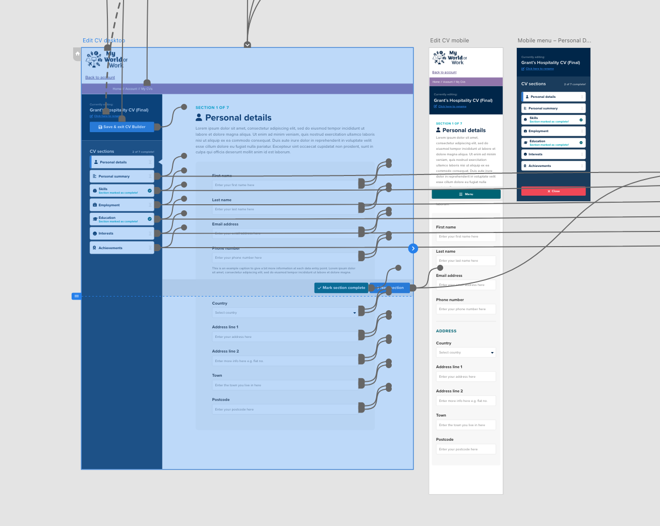
As I was starting from a position of existing brand style guides, I was able to leapfrog the need for low fidelity wireframes and building my design solutions in a high fidelity style, in line with the final tool.
Updated interface
The next step was to redesign the tool from start to finish, with an improved user experience. One main change was creating a responsive solution to the section menu, which was so easy to miss on mobile, causing users to hit a dead end at the bottom of the page when they had completed a given section. I felt a sticky menu would solved this issue, with the user being given additional context of where they are, and what is up next, on the expanded menu. Below you can see before/after versions of the expanded section menu, and My CVs library page from left to right respectively.
Assistance the whole way
One theme throughout my designed solution was to give additional context to the user wherever possible. This helps, firstly as a means to help orient the user and keep them focused on completing each chunk of the CV, as well as from an accessibility point of view. Iconography as well as type in key places to help provide a visual cue to help users of all levels of literacy. Below shows before/after views of the section 1 landing page.


